UX / UI
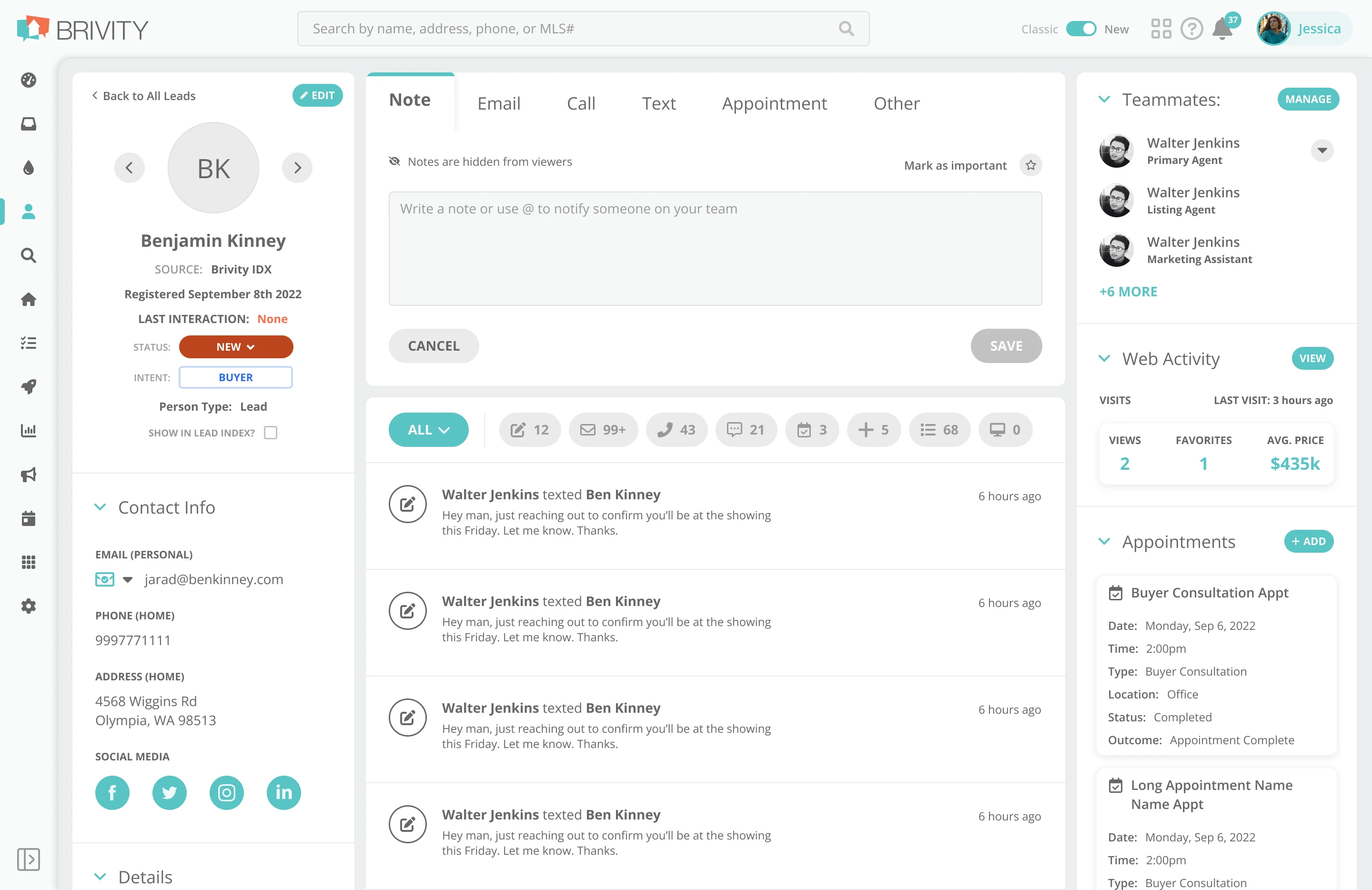
CRM Navigation
Our users had long become frustrated with our old navigation, with its dense yet finicky flyout menus upon hover. With a surge of requests to revamp the navigation in the CRM after a PLACE Partner event, I was given the go-ahead to spend the time to redesign the nav. I was so excited to jump in and work on this! It had been on my passion project list at work for some time, I was just never given the green light to work on it until now. I had such a fun time working on the nav for the CRM, it was an honor to work on a core piece of UI for the CRM, one that is present on every page.
Role
Lead UX Researcher
Lead UI Designer
Resposibilities
Requirement Definition
UX Research
UI Design
project length
3 Weeks
Defining Requirements
The next step was to define requirements for this new navigation solution so that I could confidently research proper navigation inspiration. As this project was pushed over into the green by our users themselves, I started with their feedback.
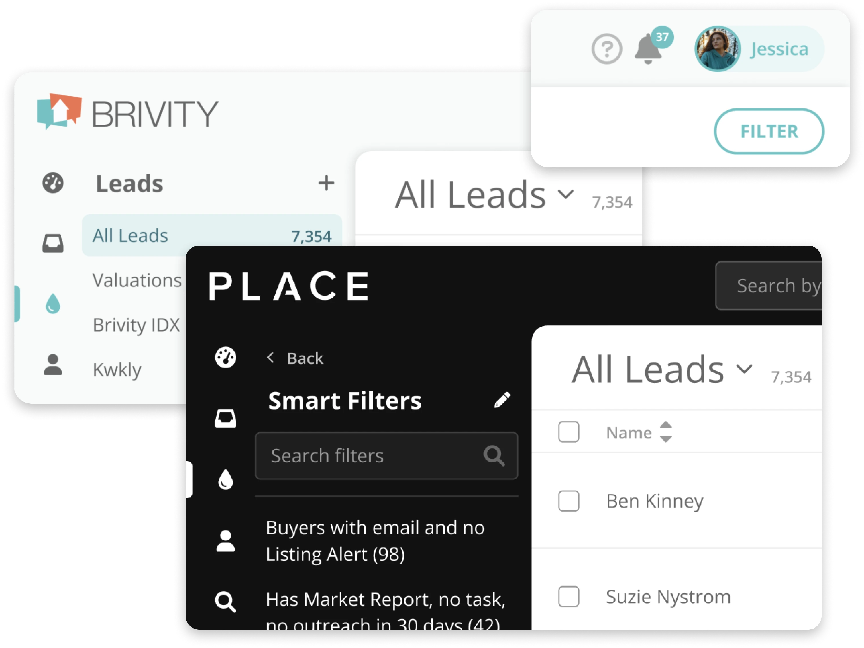
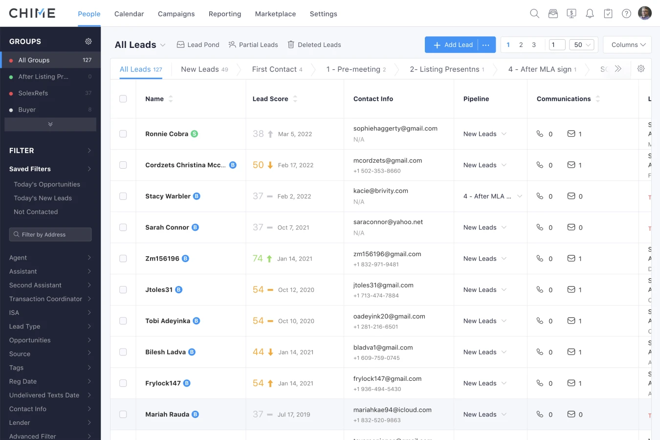
Old Navigation
Opportunity:
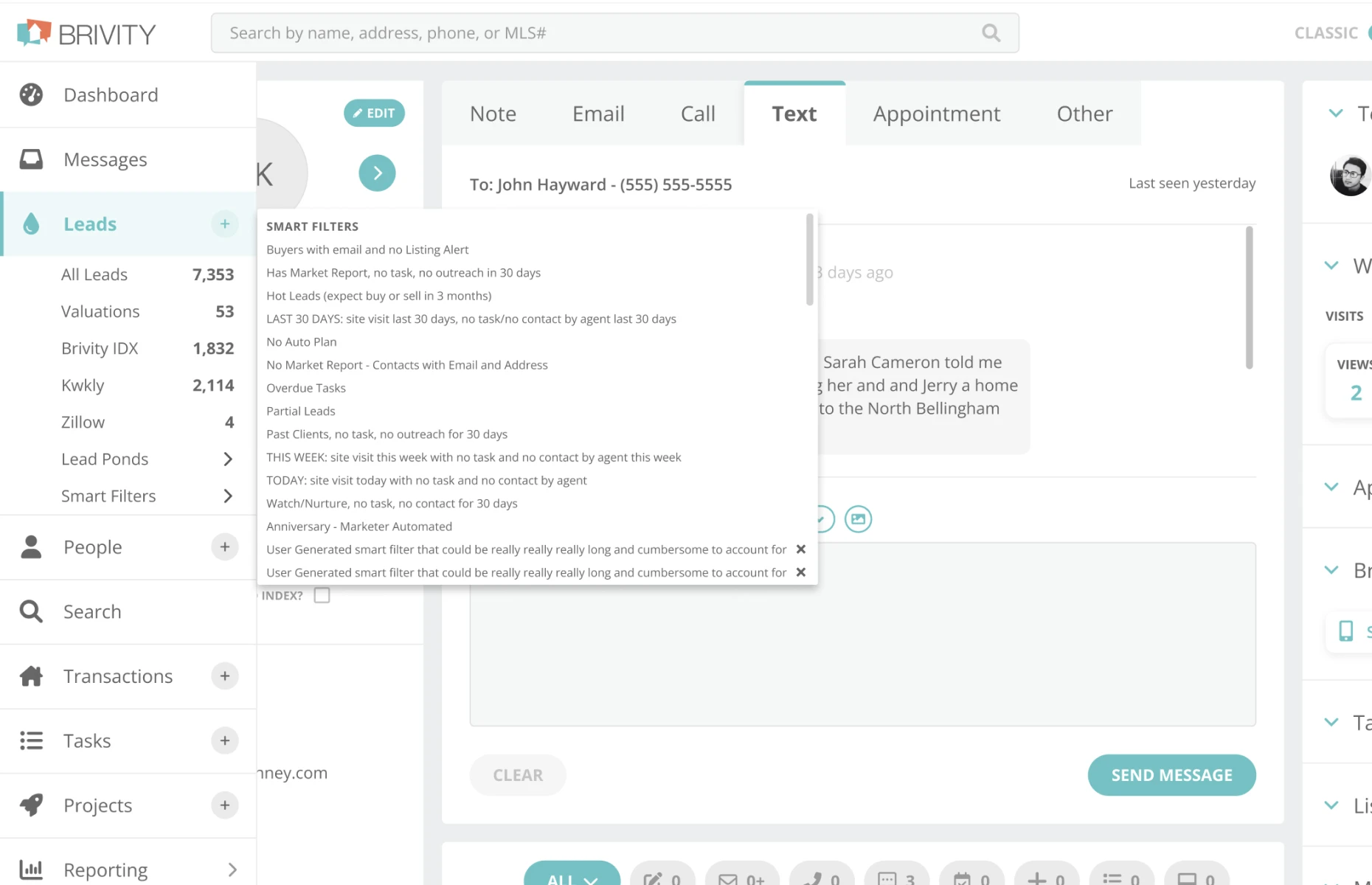
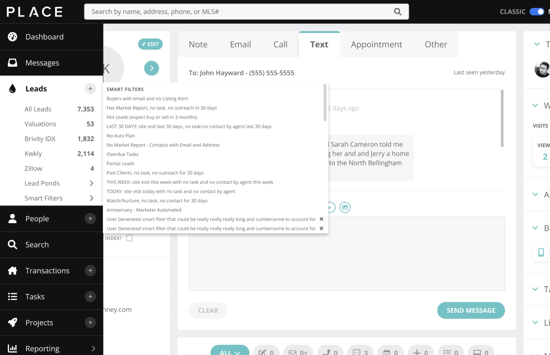
Our nav at the time had main level groups of content as well as sub-menu flyouts. These sub-menus held lists of user-defined information like our smart filter lists that were only accessible upon hover over these cascading flyout menus. This resulted in frustration for many users as there were unwanted collapses of the nav when the user slightly moved their cursor out of the menu’s hover target.
Requirement:
Be able to be pinned open by the user, and dense content lists contained within the bounds of the left nav to avoid loss of user effort in navigation.
Opportunity:
Other opportunities for improvement that I took note of were the always-visible delete icons on the smart filter list, as well as no max-width for the smart filters, some of which exceeded max character count lengths for comfortable line reading. This resulted in the flyout menus getting cut off by smaller screen sizes.
Requirement:
Confine sub-menu content within the bounds of the nav itself, removing flyouts. And there was an opportunity to save space by hiding delete buttons on individual filters when the user wasn’t editing them.
Opportunity:
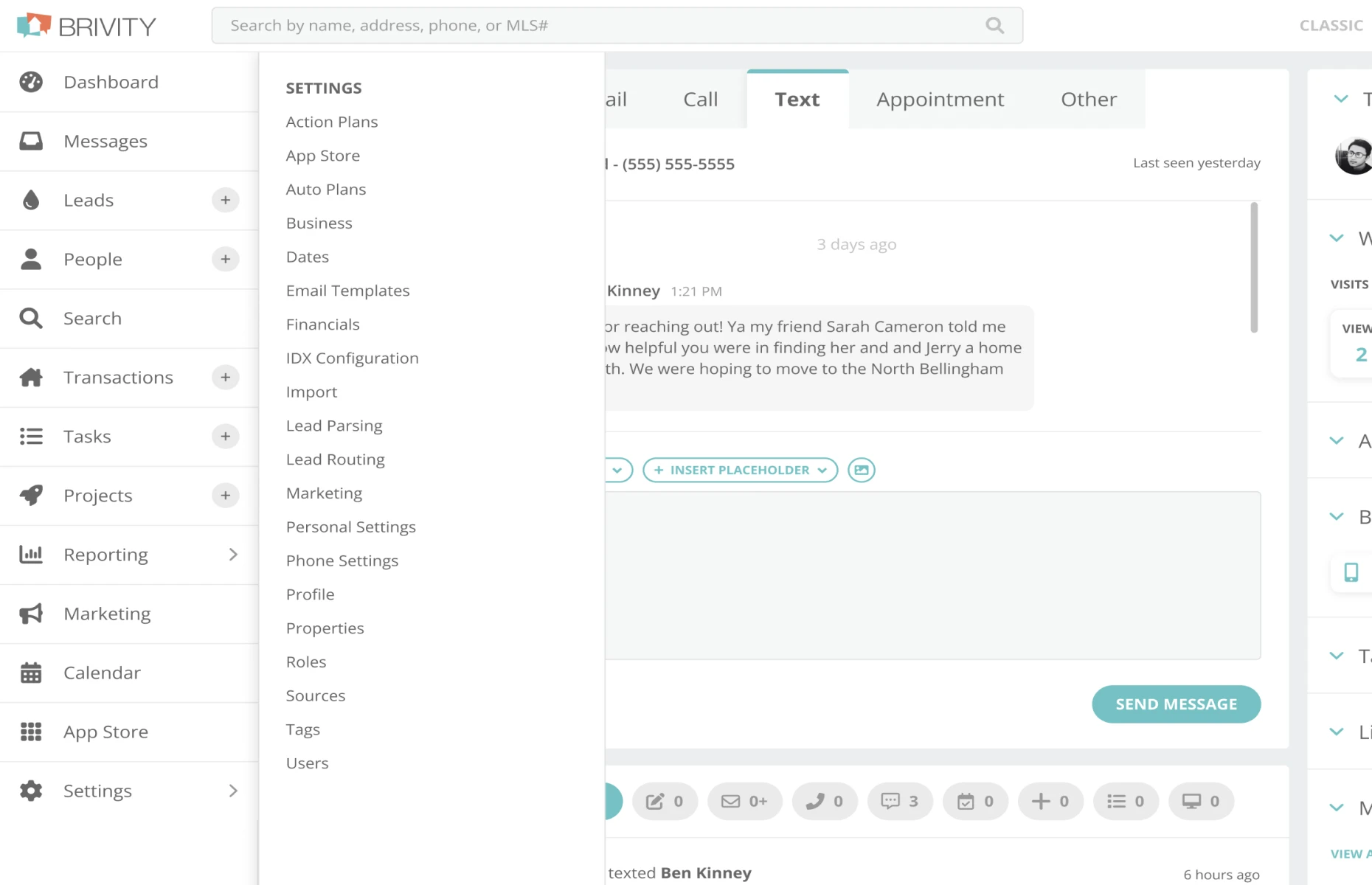
There was an opportunity in the redesign, to ensure all elements of the nav followed the PLACE theme in its entirety. The old design had some elements (flyout menus, sub-menus & search bar) that did not fully follow the secondary PLACE theme as closely as they could have.
Requirement:
Fully support the PLACE theme in addition to the Brivity theme.
Opportunity:
Problem: There were also negative legibility feedback we received from our users on our flyouts, as the type for list item names were only 9pt.
Requirement:
We would need a nav that could support type at a minimum of 12pt size.

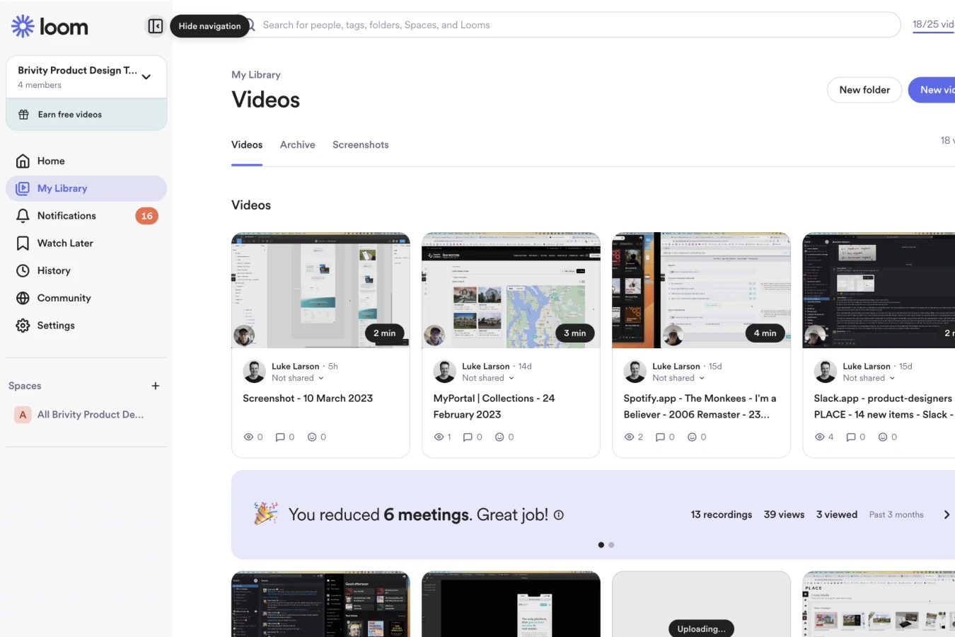
Competitive Research & Aesthetic Inspiration
Our Solution
We landed on a solution that met all of the requirements of the project, and once shipped, we received numerous appreciation emails and feedback from our users. They were truly happy with what we delivered with little-to-no criticism. The final designs, stakeholders and front end developers alike were excited to build and release to our user base.
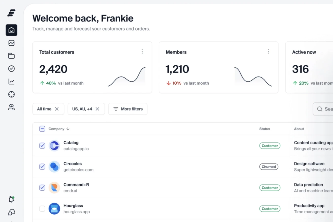
Over 97% of our CRM traffic were on desktop screen sizes, so I intentionally allotted more time for desktop screen size experimentation than I did for mobile navigation (we encourage users to use our CRM mobile app instead of the browser experience), yet I did execute a fully functional mobile navigation as well.
Final Screenshots
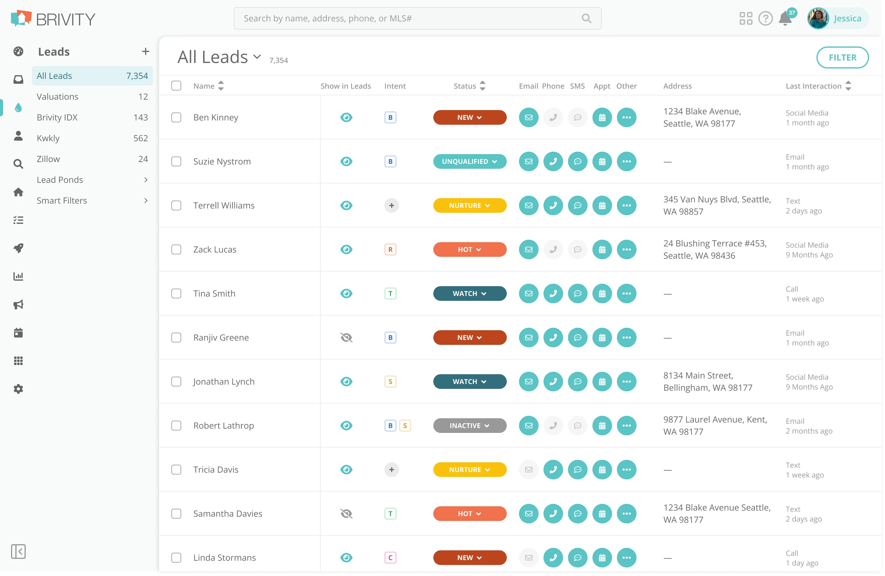


The Nav in Action
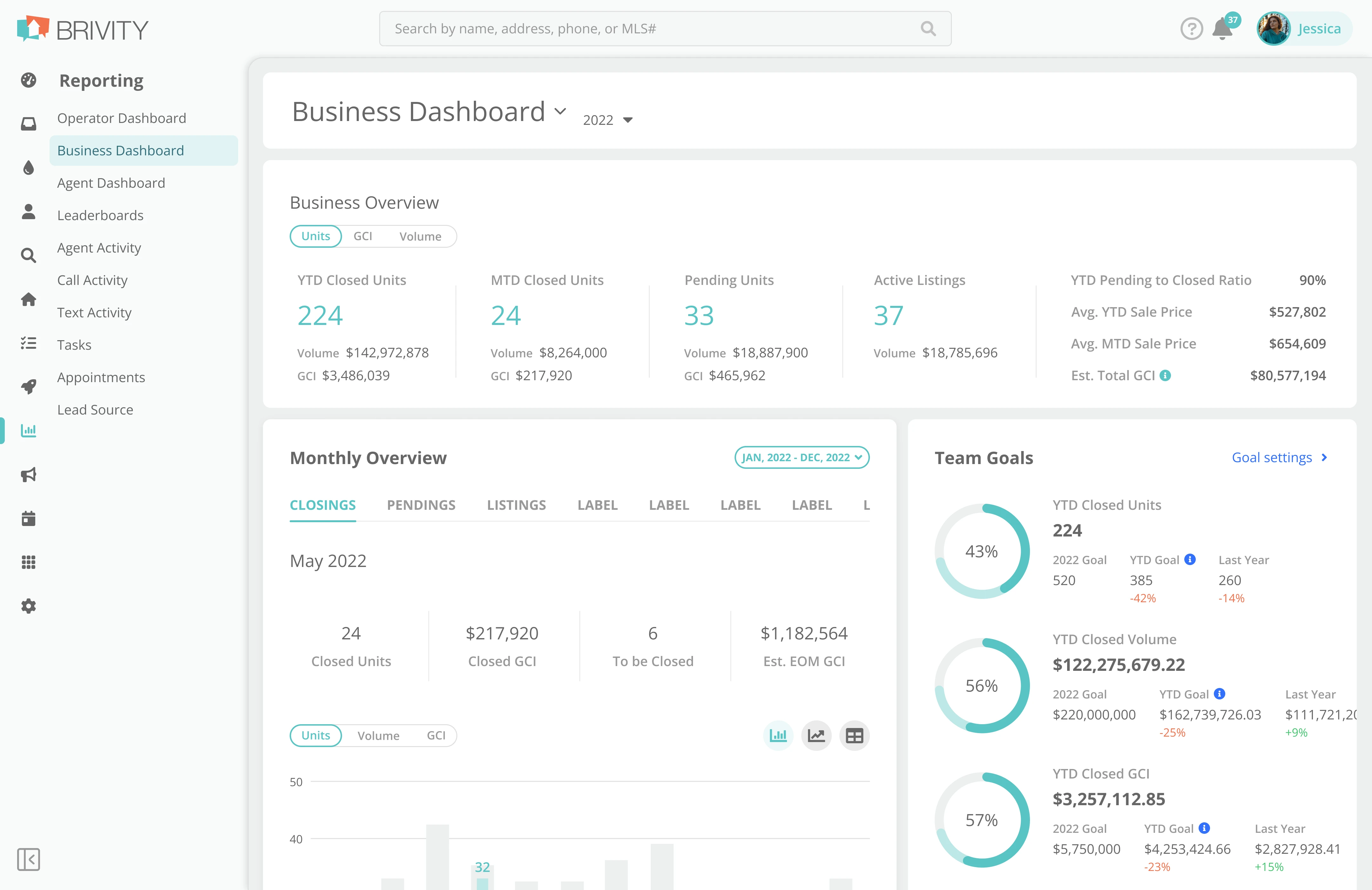
Expand/Collapse
Our final design enables to user to pin open and close the left nav as they desire. Pages with sub-menus automatically expand when the user clicks on them. Once pressing a page on a sub-menu the nav will automatically close when the page loads.
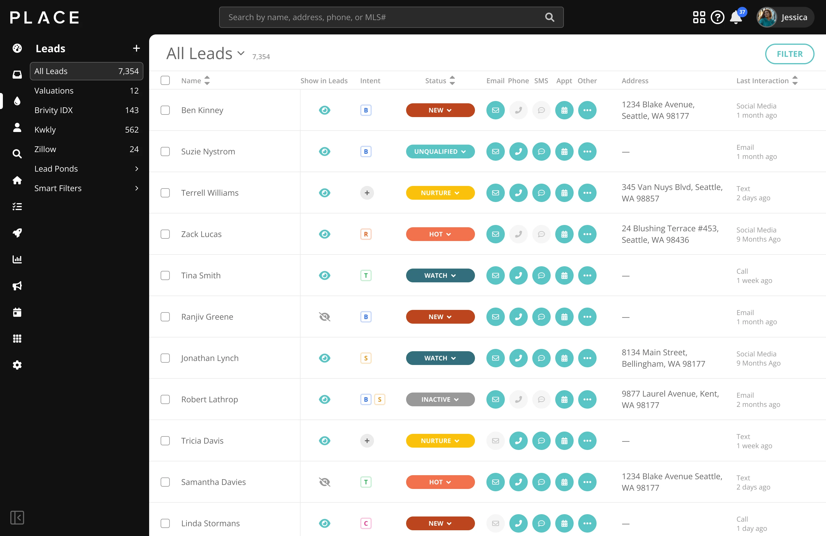
Sub Navigation Menus
Sub menu navigation is easily understood with a clean active state on pages. Users can easily dive deeper into the menus to find their individual Smart Filters & Lead Ponds, via a sliding animation that creates an affordance of diving deeper. Users have a large back button to retreat when they desire. Transparent icon buttons kept the interface clean. Menu items followed the 12pt minimum text size requirement.

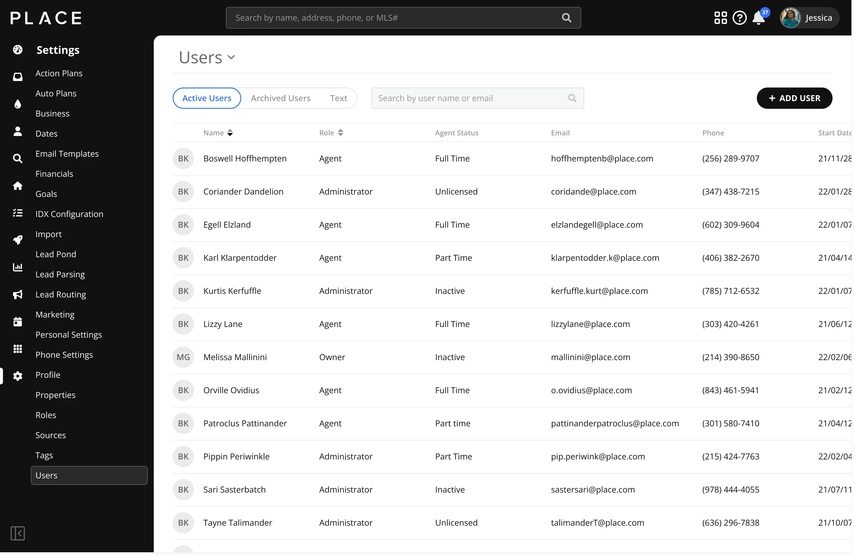
Brivity & Place Themes
A complete second theme was designed for our PLACE Partners. A sleek off-black background with hints of our semantic blue within hover & press states for menu items.
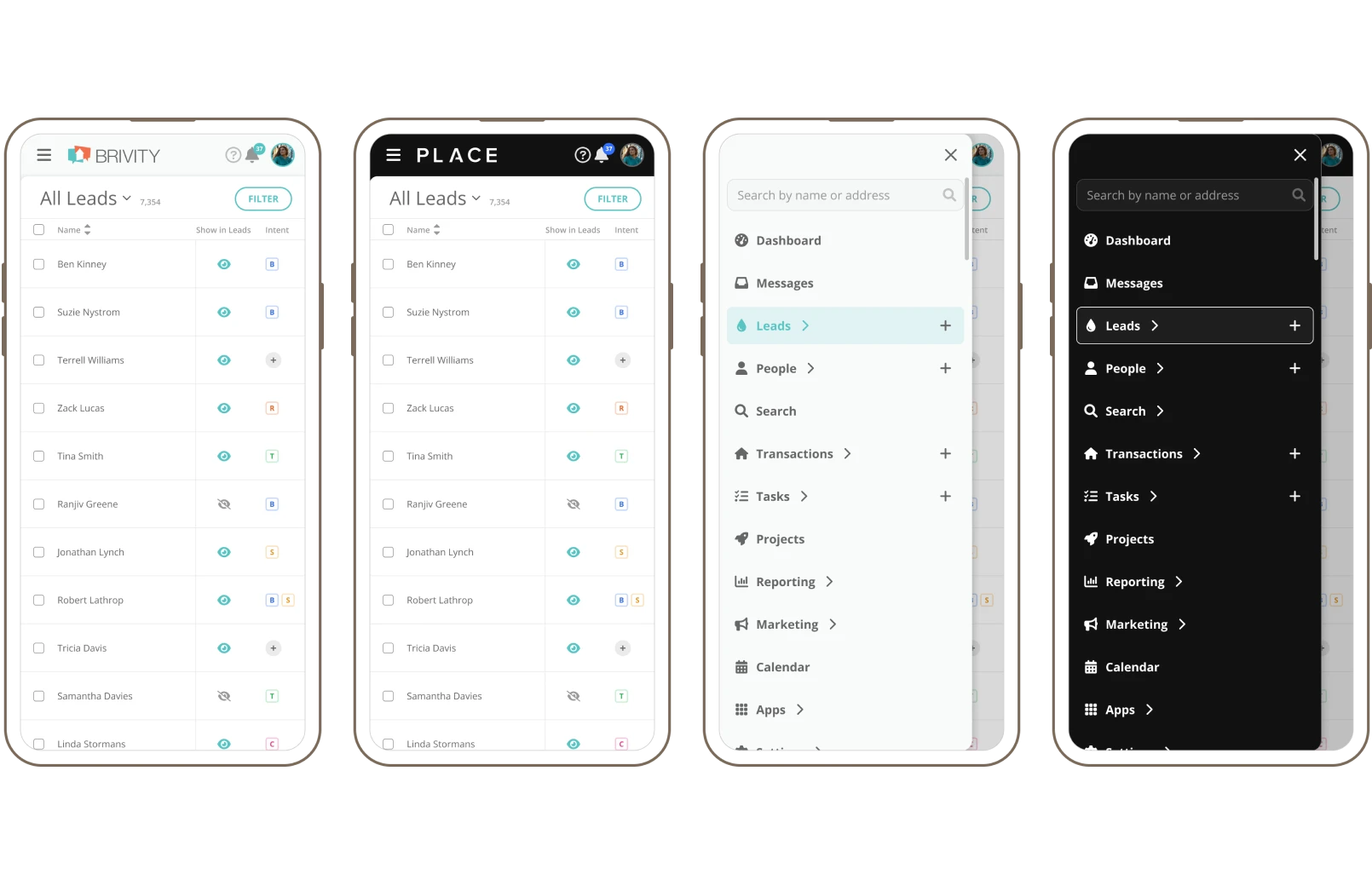
Mobile Navigation
A fully functional & responsive mobile navigation, accessible on the go. Sub menus retain the sliding animation as the desktop version of the nav has. User can close the nav anytime by clicking the close icon or by tapping off to the right of the nav.
Takeaways
The project to redesign the CRM navigation was an exciting journey that began with user frustration and culminated in a solution that not only addressed their needs but exceeded expectations. By carefully defining requirements based on user feedback and aligning with both brand themes and aesthetic inspirations, we crafted a navigation that prioritized clarity, legibility, and user control.
As the project progressed, our CEO kept a close eye on these designs and heavily pushed for a purely black and white design of the PLACE theme, where I had explored a less abrasive approach to icon and page name color with tints of white. I ended up having to forfeit to his decision.
Through thorough competitive research and design explorations, we arrived at a solution that seamlessly optimized space, improved overall user experience, and refreshed our CRM’s aesthetic. The overwhelmingly positive reception from users, stakeholders, and developers underscores the success of our efforts, demonstrating the power of user-centric design and iterative refinement.